User experience (UX) and interaction design has been taken seriously just the last years. We don’t need to go far back in time to find websites, programs and similar which had no UX-design in thought when created. These are often services where the developer who programmed the service made everything and made decisions based on “this makes sense for me, so probably everyone else”, and there you are as a user trying to guess how this service works - because we all think and interact a bit differently.
According to a study made for Episerver in late 2016, 42% of the respondents said they aborted a purchase because it was difficult to navigate the website. “Reasons for this can be for example be inadequate internal searching, unlogical menu navigation, missing filtering options or the page is not well optimized for mobile.” UX is even more important now that mobile or tablet devices are often used as primary devices by people instead of computers. This requires to think more through the display surface, as it’s smaller than a desktop, and you can’t just shrink all text and squeeze it in.
Picture source: https://blog.prototypr.io/breaking-design-rules-the-3-click-rule-of-ux-a70404909a45
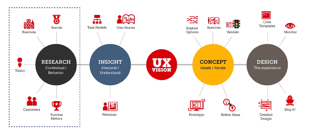
It’s important to know the user of your service, if you’re creating a e-store with items where elderly people are your main target group, you should consider this in the design process and understand the users. Each design process is somehow unique, but it can be divided into four main steps:
-
Research: This is where we investigate the business, goals and vision to understand you as a customer better of how you imagine your website to be. Most importantly we investigate the target group, their needs, requirements and behaviour.
-
Insight: Here we dig deeper into the target group to understand them better. This can be collecting data in form of previous studies, questionnaires, interviews, observation, own experience or other methods to gather more information about the group. Which then is used to create fictive user and stories to simulate how the user behaves, to better simulate the problems or challenges the user face.
-
Concept: We start to explore the different options of creating the new service with all the information with the previous points in the back of our head. We start sketching our ideas and validate them with both our collected data, users and your vision and opinions, this process goes on by refining new ideas and concepts until we can group all our ideas to a few low fidelity (not very detailed) prototypes to show you different alternatives and options.
-
Design: Once the prototyping is finished we start creating high fidelity (detailed) design sketches of your new service, this is the point where the graphical designer incorporates our UX decision into a full scale design with colors, details, images and similar. After this design phase is finished, the project is now forwarded to the programmer team who will implement the design.
How does this benefit?
Having a proper design cycle, where the users are taken in account, investigated and understood, where the concepts and prototypes are created based on understanding the users - we ensure a more better experience and in a e-commerce world, everything that is annoying or not understandable on a store might become a missed sale because a user gives up. It’s rare users give you direct feedback of your service unless you specifically ask them, and not all users would be interested in answering a questionnaire when they were about to purchase something, as this can also break the shopping process. It also benefits in time spent for development and maintenance of the service, editing important parts of a user experience can be time consuming. Finding such feedback in advance is always beneficial.
If the programmers get a well documented and thought through draft of the website they’re supposed to implement it saves development time as they don’t need to stop and start making own decisions because aspects of the project were not thought through or documented, such as responsiveness of a website. This also endangers the project to decisions not made by a interaction designer, weakening the UX.
According to a Microsoft Research study in 2011, they found out that the first 10 seconds on a website is the most crucial one, and where most new users leave the page. This is where the user checks the page and if they would like to stay or not, and if the company is trustworthy and the website is user friendly, there is no doubt that having a user friendly website and good design is beneficial.
Adressing the annoyances
As a interaction designer there are certain things that annoy me when I visit pages, which could easily be prevented with some simple UX-design. We have to remember that often a user will blame themselves if they can’t figure out a website, and we don’t want a user who think bad of themselves when trying to purchase something. Here are some thoughts and frustration I’ve found across the web I’d like to share:
The register-wall
Why does the user need to register a profile at the webstore to see the total price and shipping options? There is a big risk of them aborting their purchase and go to another shop that gives them the option to continue without registering or at least see the shipping options and total.
Inhumane-captcha
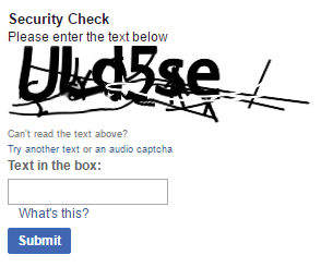
Good luck solving this. The purpose is good of having captcha with all the internet robots. Luckily recently Google released it’s new version of captcha as shown below. One click, and all magic happens without you doing anything asuser, if it fails to validate you it simply asks you to solve a simple puzzle such as “click at all images which is a cat”.

Picture source: https://www.google.com/recaptcha/intro/
Wannabe-totally-unique
Some websites take design to a brand new level, with fancy animations, elements in triangles instead of boxes, floating animations and flashing product display. I’m not saying this is wrong, but as a designer there is a principle called consistency, it’s important that your whole page has a consistent design, but also that you keep the basic consistency of how you put a product in a cart for example; giving a user a steep new learning curve and inventing new ways to perform a simple purchase is not a good idea, it should all build on previous knowledge on how a user expects elements of the website to work.
Birthdate-check
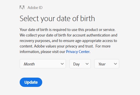
Why does the user need to specify their exact birth date? If it’s used for validation and not stored in any way, wouldn’t a checkbox “I confirm I’m X age or over” be enough? Personally I’m just picking a random month and date, then scroll randomly far down in year and select one, because why would I use time to fill my exact date if it’s used for verification only? The lesson here is that users are also lazy, asking them for more information or action than needed is not popular.
Mobile-is-desktop
There are examples where the mobile version has exactly the same text and information as the desktop version. It’s not necessarily wrong, but on a small display surface as a mobile it’s important to keep the visibility of the items that actually are important and hide or remove items that are not so important. For example when browsing a product list on mobile, showing 50 items each page is not reasonable as it is on a desktop, and then try to squeeze in all the product details as well, which can be partly removed as it’s shown once you click on the product.
Cookie-popup

A designer's nightmare, but a requirement in EU-countries. Luckily if your site is hosted in Norway, you don’t need a pop-up at all, it’s enough with explanation in the privacy policy of the cookies and what they’re used for. If you’re not hosted in Norway there are better ways to implement this popup, and also make it match the website and not look like something added in the last minute. Especially on mobiles this popup is dangerous when it comes to obscuring the view and taking almost half of your screen.
Examples of good UX and choices
Action colors

Which button would you press to pay your purchase? Colors are often associated with different things, such as red is: danger, stop, don’t click me. In a UX process the blue or other more neutral color be picked. Picking correct colors is important!
Feedback and delight
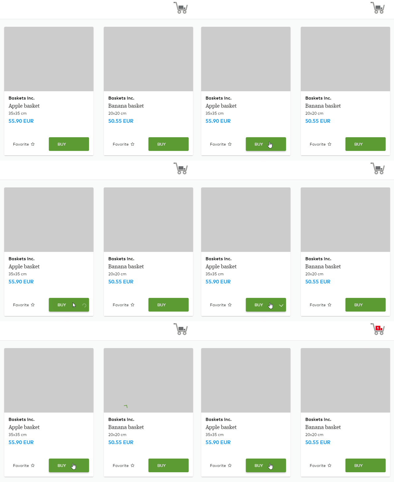
It’s important to give users feedback if they click something. For example you change a product filter setting, you’d like to show a indication the results are loading with animation, or when you are processing a payment - which can often be a stressful moment of a user if it takes longer time than usual. For example enjoy this delightful animation:

Here you see an example we’ve created: Once you click on the add product button, a loading saying it’s processing and a smooth animation to show it’s now in your cart. The user gets a feedback all the way until it’s in your cart, knowing they have pressed the button and when its processing.
Summary
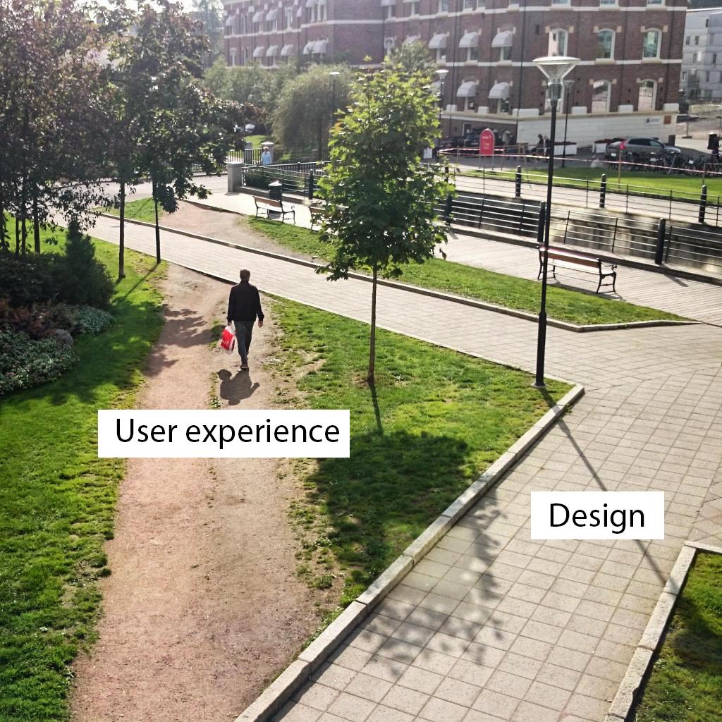
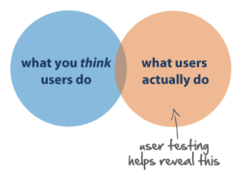
We can end this blog post with the cliche picture of user experience vs design. This picture is over-used as an example, but at the same time a perfect example of how users often take their own paths, there is one catch though: Websites are made to work as X or Y, it’s not often users can make their own work path, and that’s why UX is even more important here, to understand the users and how they want to use the site. Failure to do so risks in annoyed users and those users might not become your customer as they escape to another competitor.
UX design is important. It will benefit your service, you and your customers. Making everyone happy, and happy people are more likely to perform and finish a purchase.
Main picture source: Pinterest https://s-media-cache-ak0.pinimg.com/originals/2e/0f/a3/2e0fa3e9989affc10dbc2636d542a30e.png
UX vs Design picture source: https://guycooksondotcom.files.wordpress.com/2015/06/user-experience-vs-design.jpeg
Contact us


